Farm Fresh Case Study
I was assigned the task to build an app that could help bring two different groups of people together around a shared interest. The project required the creator to do research and pitch the idea of their apps with in a presentation. From there they need to develop two different user personas and the user journeys that they would go through. There was a round of sketching before the work of wire frames was done in Adobe XD.
Product Pitch
To start off building my app, I had to pitch my idea to be approved. For the pitch, I created a presentation that listed out my goals and ideas for the project. I noted the possible competitors or failures of apps that were similar to mine. Certain slides gave reasonings on why this product would be helpful if it was created by using examples of a vendor and consumers.
Competitors Analysis
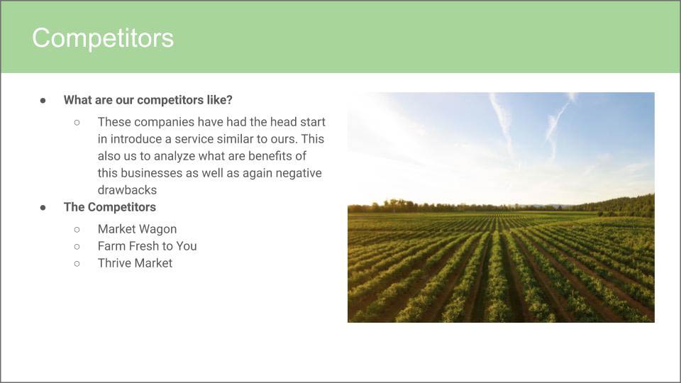
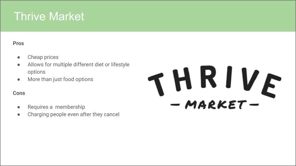
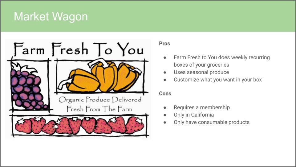
In my presentation one of my focal points was on possible competitors my app would have if created. To start I looked then positive benefits that came from the app or service that were functional or user friendly. I focused my special attention on the flaws that these apps and how I make my app better in where others lacked. For example, most of these services required the consumer to have a paid membership to even start using the app. In my app, it would have a free account for consumers to use.
User Personas
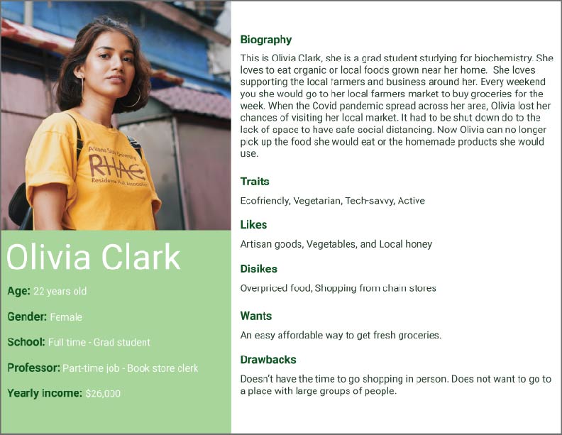
The next step in the app making process is to create user personas. A user persona is a fictional person that is based on the data that matches a target group. The first user persona created is named Olivia and she represents the consumers who will buy products off of the app. The second person is named Miguel, he is the representation of a vendor who is trying to sell if products.
User Journeys
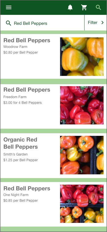
After building the user personas of the targeted audiences, I need to build their journeys. A user journey is a guide to how a certain person might approach the app. This could be on what areas they focus on or need to complete their goal. For the user persona Olivia, she goes through the process of buying bell peppers through the app. The user persona Miguel follows the steps on how to create his vendor account so he can sell products.
Sketches
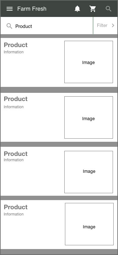
After creating user journeys, it now leads to the sketching stage. These are early designs and concepts of how the app should be laid out. The following of how I was sketching was based on the user journey that was made. This was I would know what types of screen I would need to design later on for the final products. These would be adding a search bar, filter menus, or login screens.
Wireframes
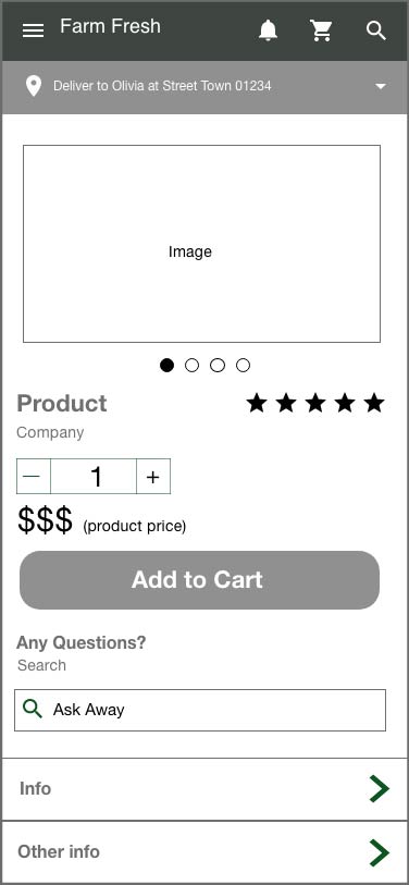
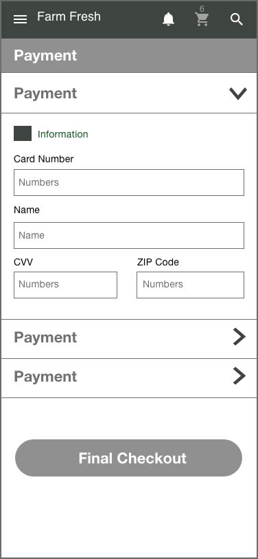
Once the physical sketching phase is finish then it will move on to digital. From here the sketches are translated into Adobe XD is simple wireframes. This process is blocking out the shapes on the dimensions of a phone. The wireframes are in a monochrome color scheme and using ‘lorem ipsum’ to block out text.
Final Screens
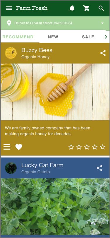
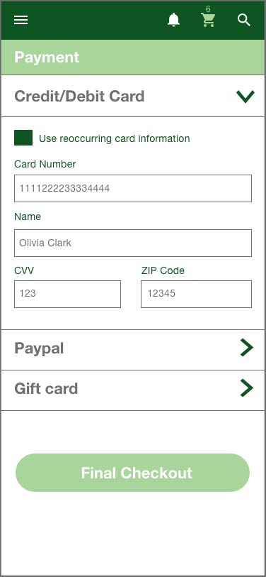
After the wireframes have created a basic outline of how the app will flow. The real design process can take over, this involves creating copy, color, and images. When choosing the colors of the app, I went for a green and white scheme to give that eco-friendly feeling. The images were chosen to show how bright and beautiful the products being sold look.
